


Logo, corporate styling and website
I made the logo and house style for 'Veterinary Karolien Van Diest' back in 2006. In the following years the small company evolved to a Veterinary Center. In 2012 the name changed to 'Vets & Co' to reflect the current situation. This lead to a small restyled of the logo.
This project gained some exposure in Belgium since not a lot of veterinary's have a 'real' logo (mostly something recycled containing a snake and a cross).
In the following years I made several logo's for veterinaries in Belgium (if I am not mistaken the count is seven, I do not plan to make any more).

Vets & co logo.
In Belgium veterinary's typically use blue as main color.
As you can see we went for something different.
In Belgium veterinary's typically use blue as main color.
As you can see we went for something different.
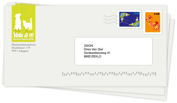
Letterhead and stamp detail, picture of the actual printed work.

All paper components of the the corporate style are printed with 2 solid (pantone) colors to obtain a very bright green. The grey color is not only used for the texts but also for the shadows in the logo.
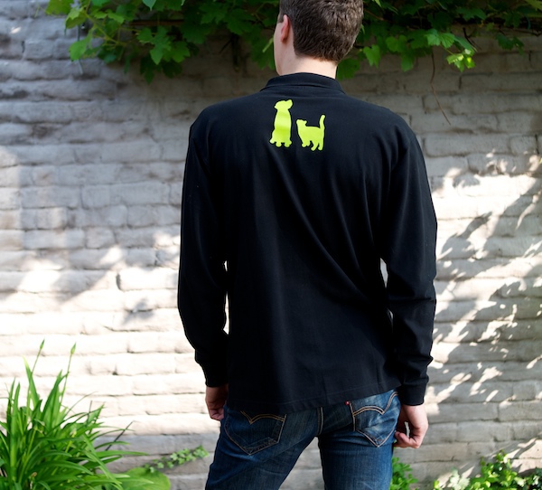
The polo shirts are first printed in white, then in green for a brighter color.

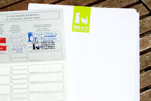
Small stickers for animal passports. The stickers are black on the background so they can be used on surfaces that are already printed.
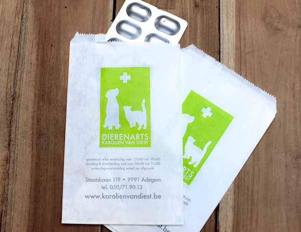
Small paper bags used to pack drugs or small items.
Since there are a lot of occasions where only 1 or 2 tablets are necessary these bags come in very handy. It's also practical to write some notes on.
Since there are a lot of occasions where only 1 or 2 tablets are necessary these bags come in very handy. It's also practical to write some notes on.
The corporate styling is a lot more extensive then then the items showed above. I'll gradually add the design for medical stickers, billboards, leaflets, ...


